
Illustrations for poetri book THE ETYMOLOGY OF YOU AND ME
This anthology is for word lovers, romantic lovers, and lovers of the moon. For anyone interested in self-expansion, exploration of existence, and the universe itself, may you find both solace and joy in the linguistic play painted across these pages written in honor of my/your/our journey in the elucidation of the human experience as spiritual beings.
Collaboration with
CMCC FOUNDATION
2025 - 2026
The CMCC Foundation is an international research centre dedicated to climate science, sustainability, and the interaction between environmental change and society. Working at the intersection of research and policy, the Foundation develops scientific knowledge to support evidence-based decision-making and climate action.
During my collaboration with CMCC, I supported research and conference projects through visual communication and design.
My work included the design and illustration of posters and conference banners, logo and branding development, presentation design, and live visual board sketching during conference talks.
Through these projects, I helped translate complex scientific content into clear, engaging, and visually structured formats — making research more accessible to diverse audiences.
Blue-Green project
For the Blue Green project — a policy initiative focused on sustainable development and environmental scenarios for the Northern Adriatic region — I designed an interactive conference banner that served as a collaborative tool. Participants were able to add notes directly on the banner during the event, helping to visually capture discussions and insights in real time.


For the DesirMED project — a Horizon Europe initiative promoting nature-based climate adaptation solutions in Mediterranean regions — I designed a series of posters and banners with resized versions for various conference formats. My work supported the project’s visual communication and helped present key information and outcomes across events.
DesirMed
A creative conference poster visualising the project’s development process as a cookie recipe.
Each stage was presented as an ingredient or step in baking, transforming complex policy work into a playful and accessible visual narrative.

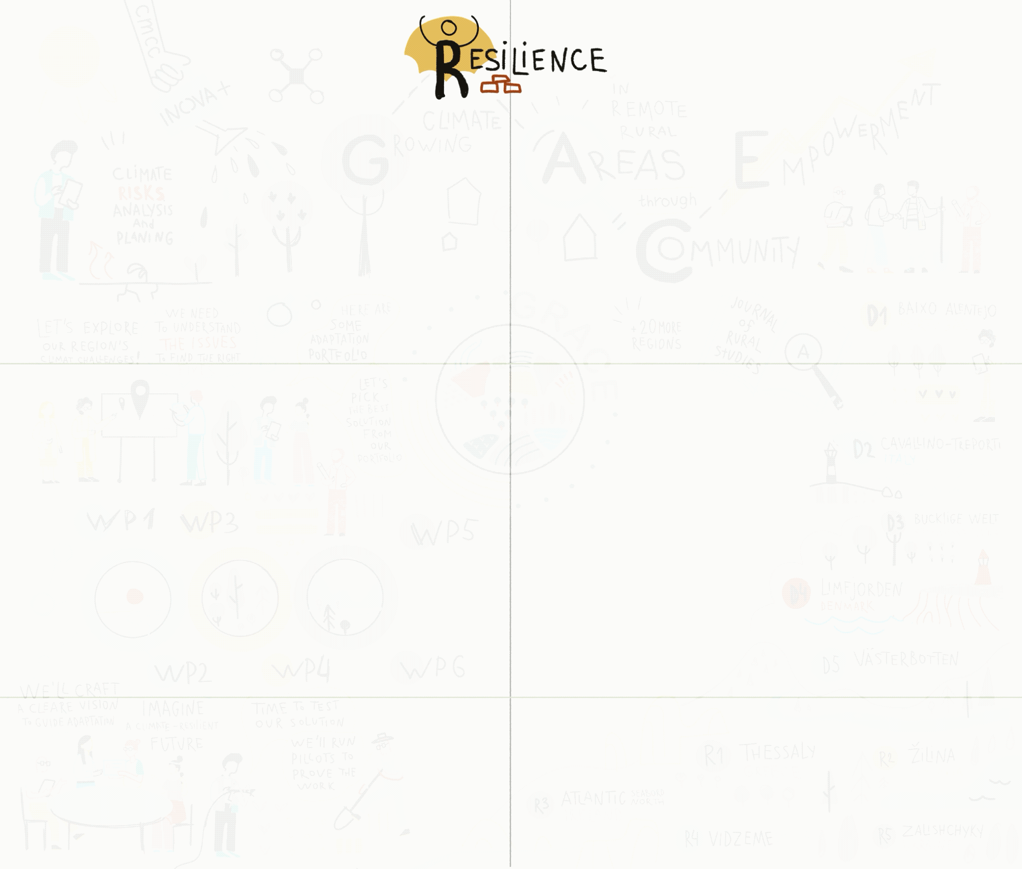
GRACE project
GRACE is a Horizon Europe initiative focused on empowering rural communities to build climate resilience through nature-based, regenerative solutions and inclusive, place-based approaches.


For the GRACE project, I developed the logo and brand color palette, establishing a clear and cohesive visual identity.
During the project’s kick-off conference, I also created live visual scribing boards, capturing key messages and highlighting the main themes of the presentations in real time.
This section showcases my creative process for the GRACE project logo — from initial sketches and color experiments to the final visual identity, highlighting the development of ideas and visual concepts.


Live Visual Scribing
During the GRACE kick-off conference, I captured the unfolding discussions on a visual board, turning spoken ideas into structured illustrations in real time. The board provided participants with an immediate, engaging overview of the project’s concepts and flow.


Board Design & Production
I handled the full process of creating the conference board — from initial sketches and technical drawings to material selection, assembly, and final presentation — ensuring both visual clarity and practical functionality.
I developed and refined the conference board to ensure it was not only visually clear but also engaging for participants.
This included testing layout ideas, experimenting with visual hierarchy, and incorporating interactive elements to guide viewers through the content.
MY PROJECTS:


